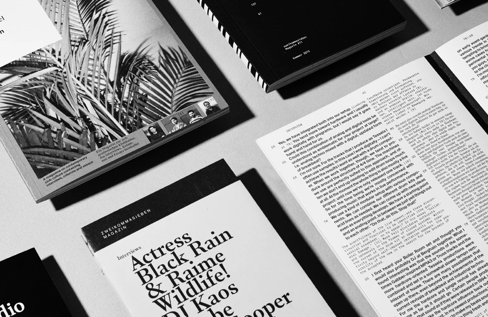
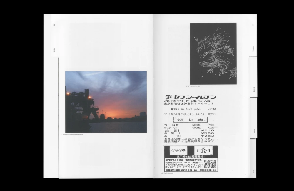
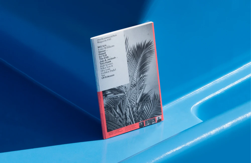
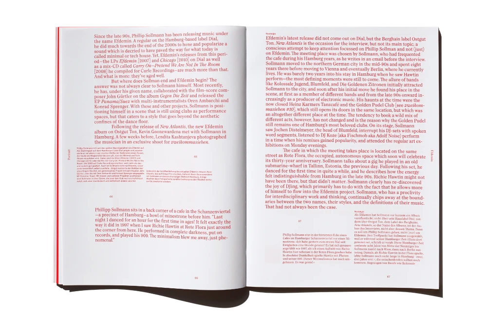
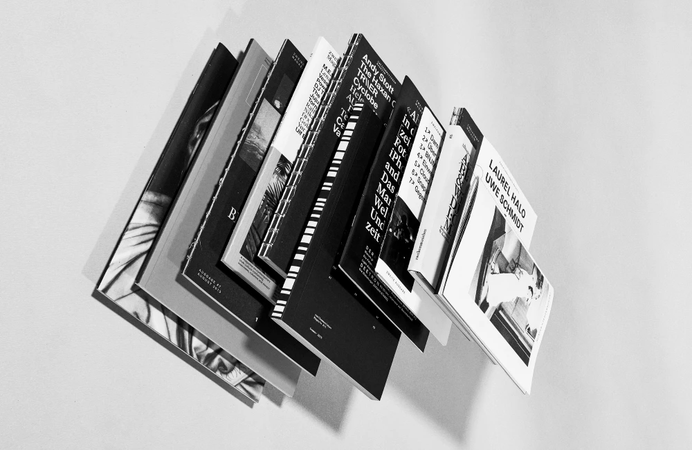
Präsens Editionen is a Swiss publishing and music label. Together with Guy Schwegler, Michael Volken, Remo Bitzi and Marc Schwegler we founded it in 2011 while launching zweikommasieben Magazin. Since then, Präsens Editionen has released music on vinyl, cassette and in digital formats and have published, zines, magazines, books and some oddities as well. Check out the platform here: praesenseditionen.ch
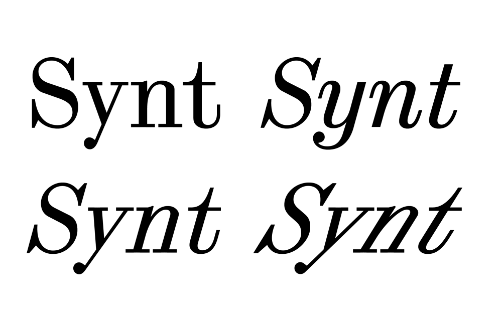
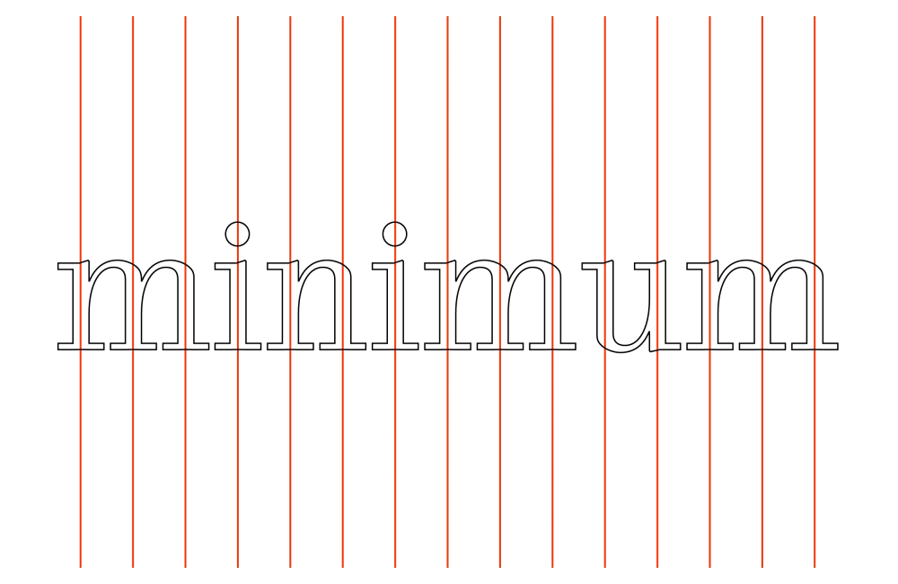
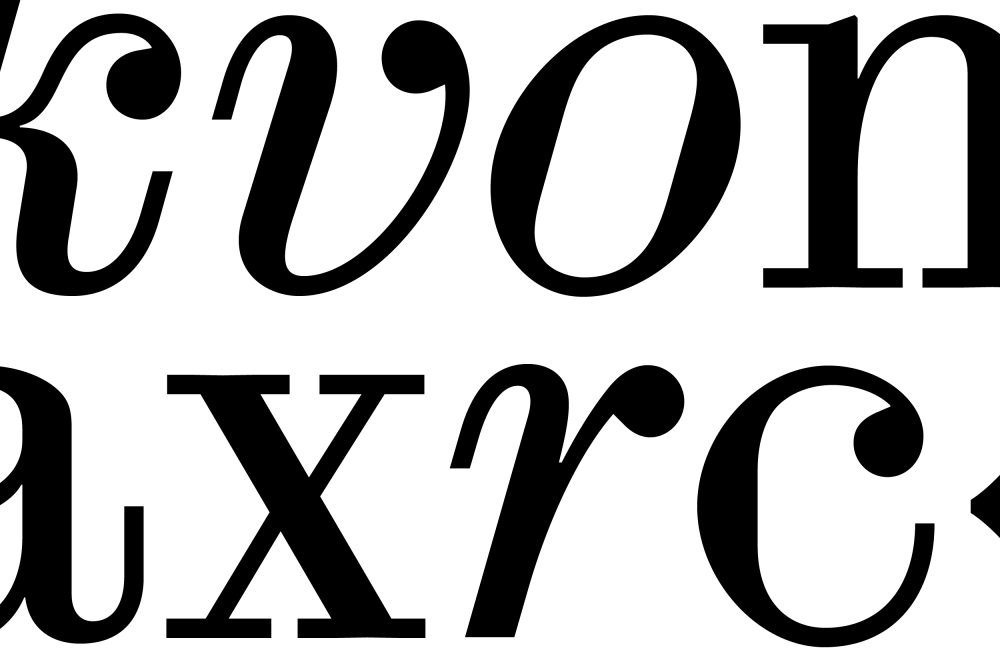
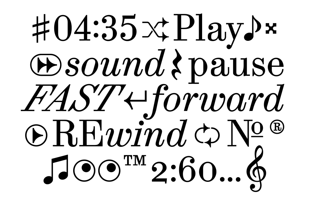
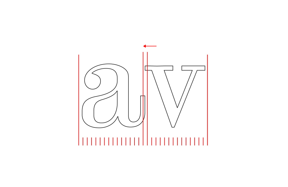
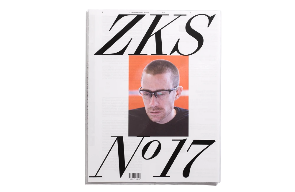
Synt is a typeface in the Scotch Roman style with a parametric stem-rhythm. It was designed alongside issue 17 of sound and club culture magazine zweikommasieben. Synt reimagines the typefaces documented in The Practise of Typography (1900) by Theodore Low De Vinne — a book that tells the story of the Scotch Roman style — in the context of a techno beat. Synt’s rhythm is strict, with each stem at an equal distance from the last, and its speed can be turned up or down by selecting different styles of the font’s slant cuts, which sit at drastic angles. Another detail of the font is the little kink at the end of the stems. They counter-balance the weight and help to print the typeface sharper. Four cuts are currently available, a Regular style, Slant (with an angle of 16°), Turbo (with an angle of 32°), and Italics (with an angle of 16°).
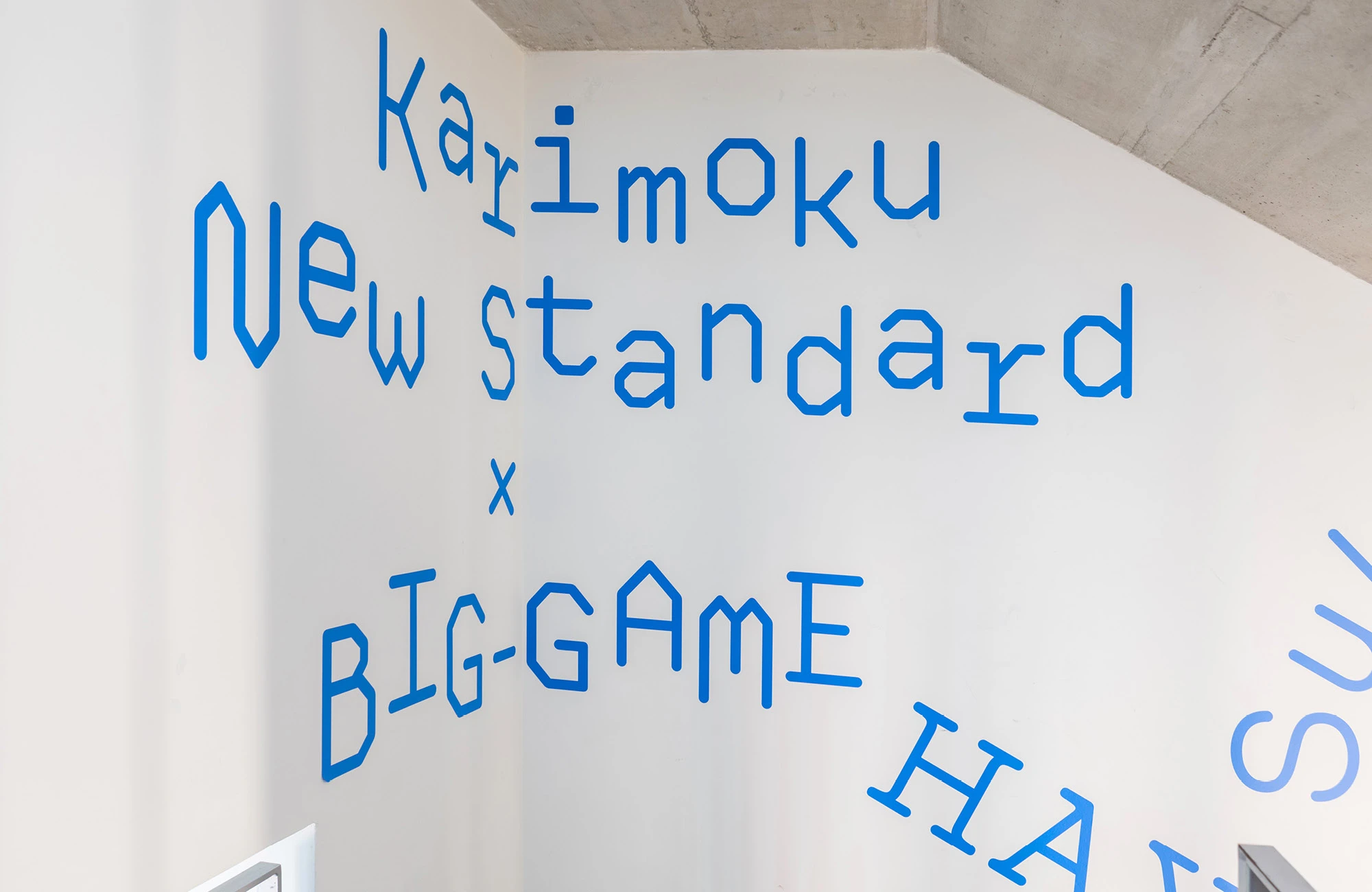
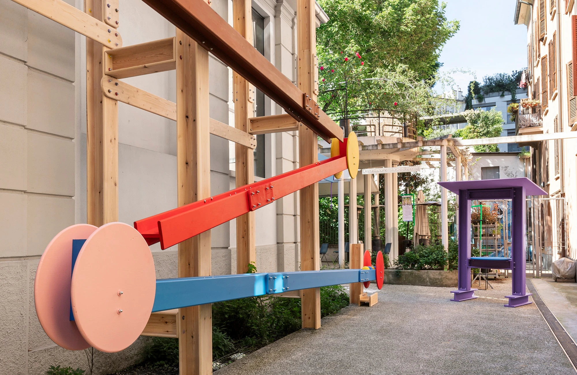
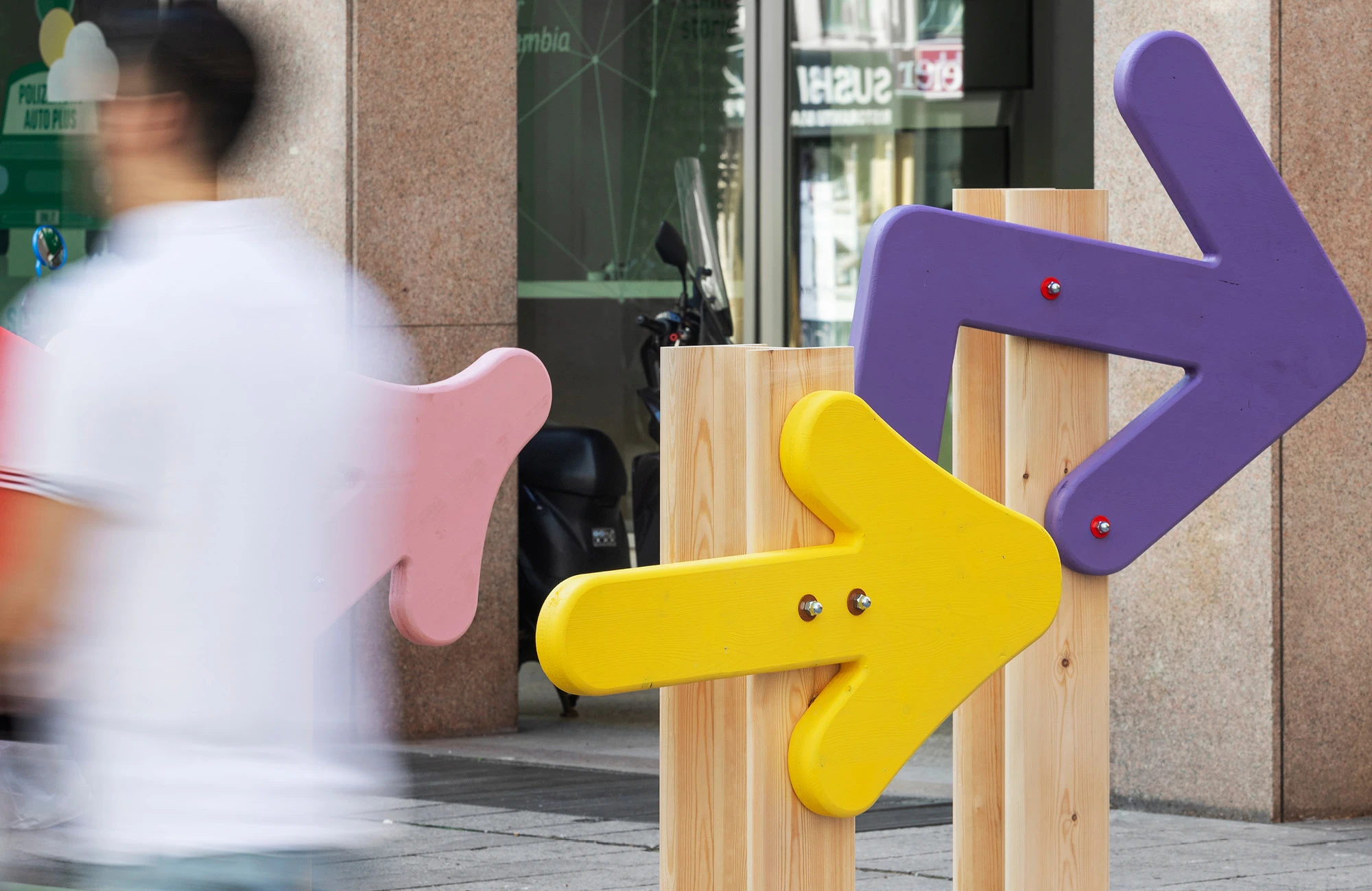
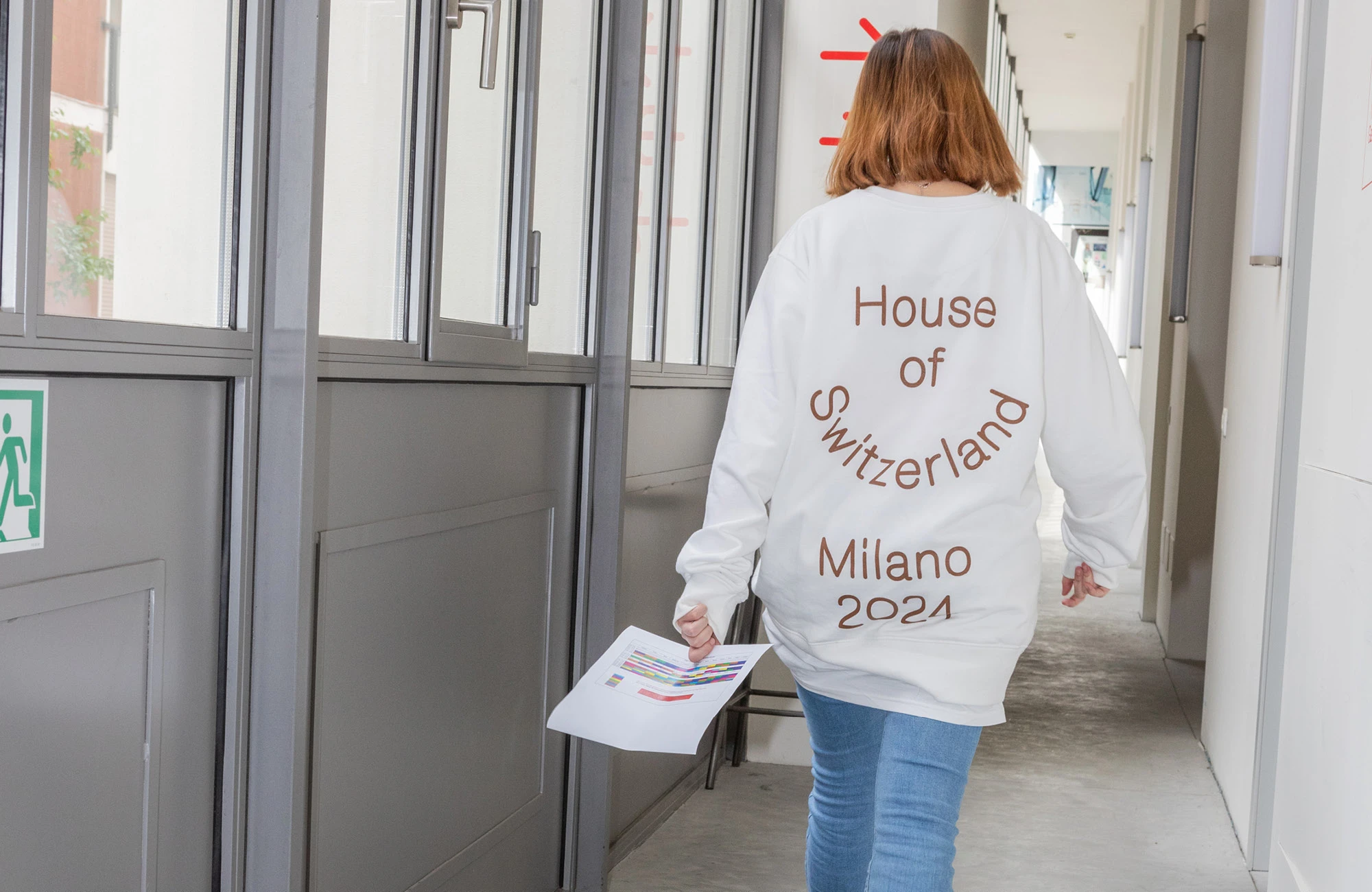
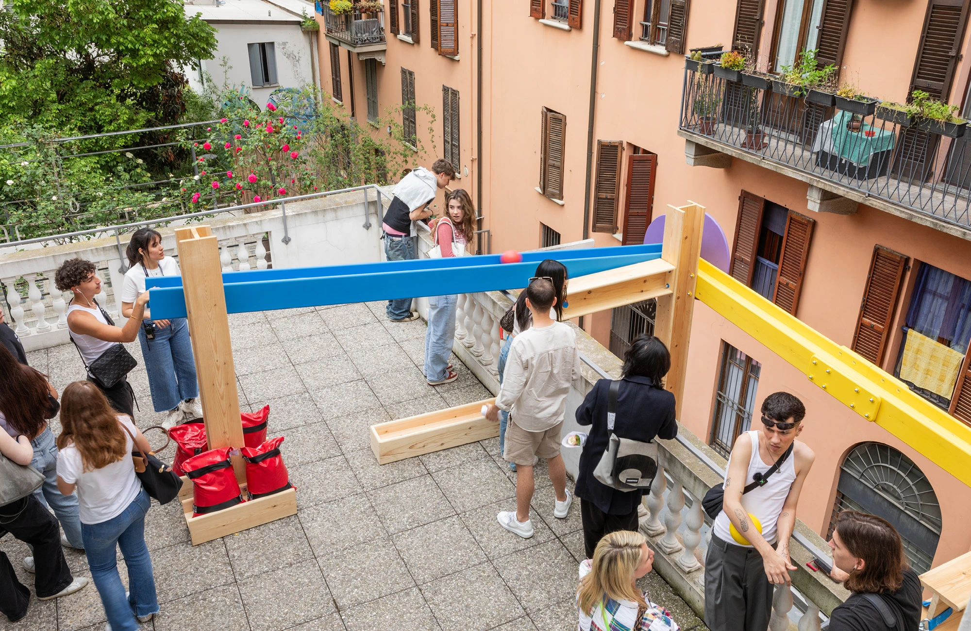
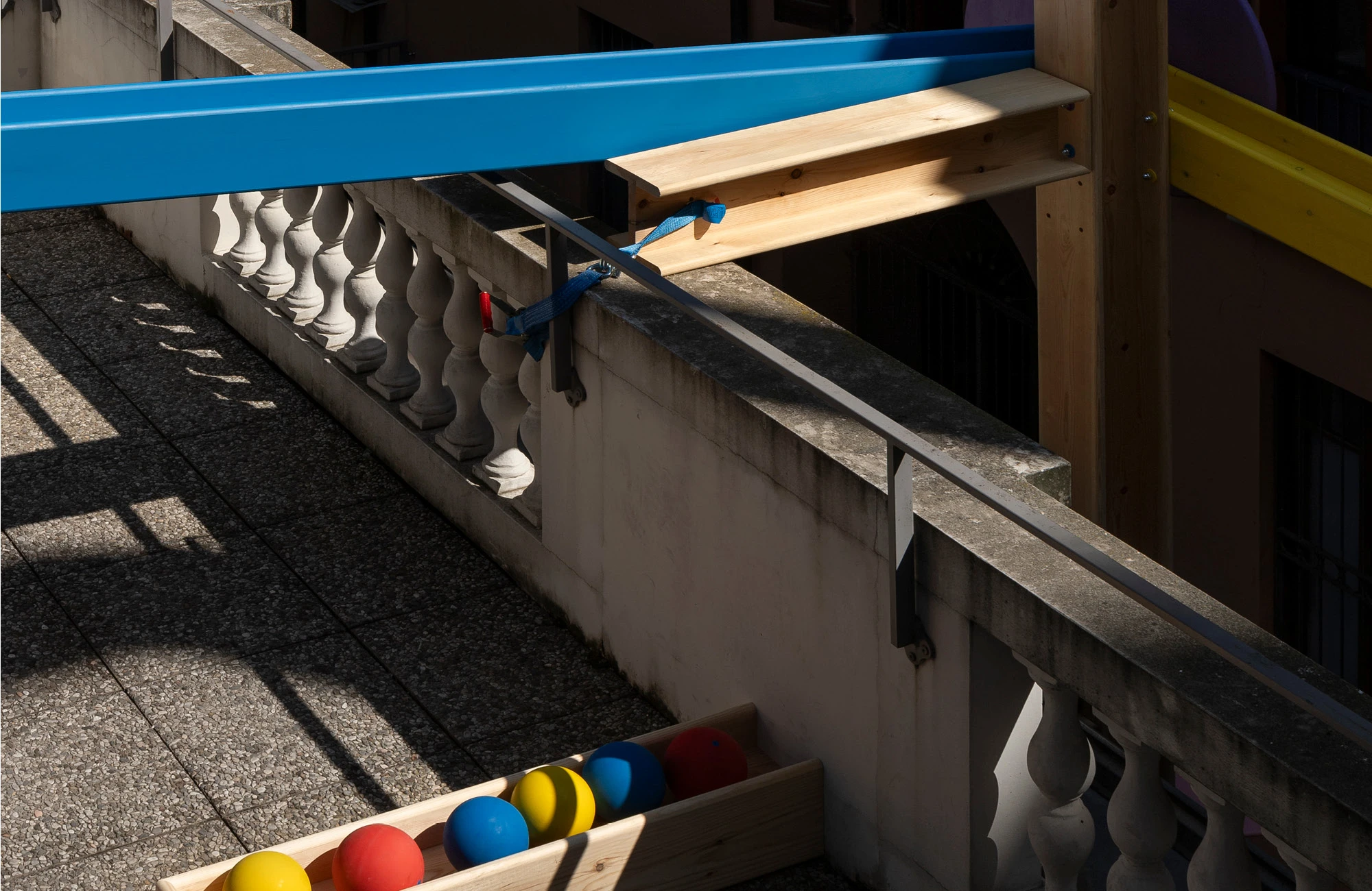
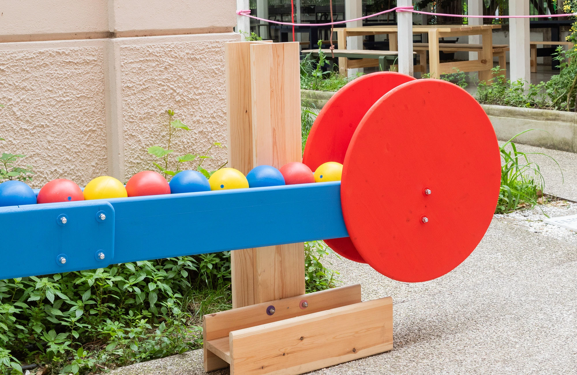
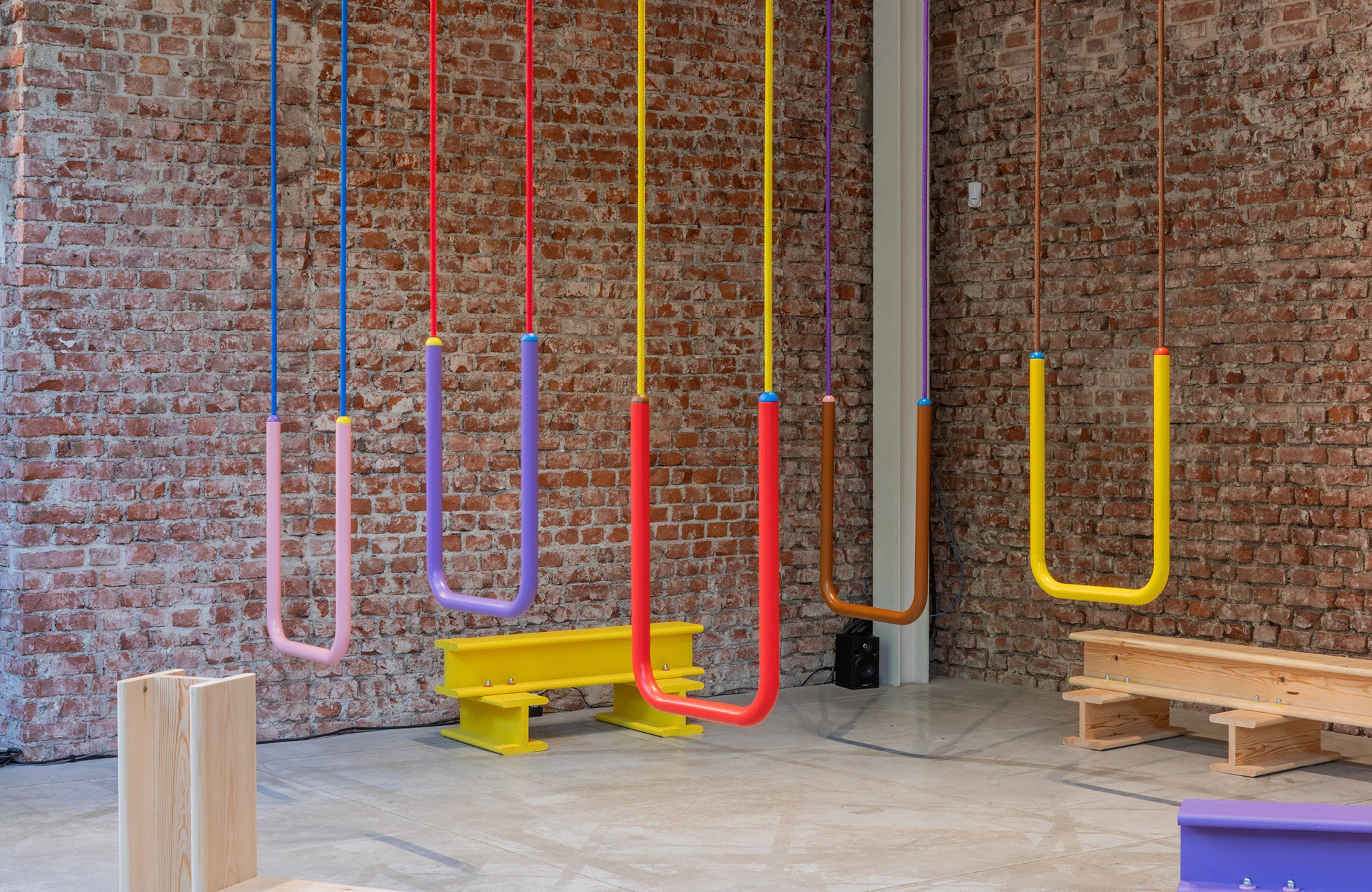
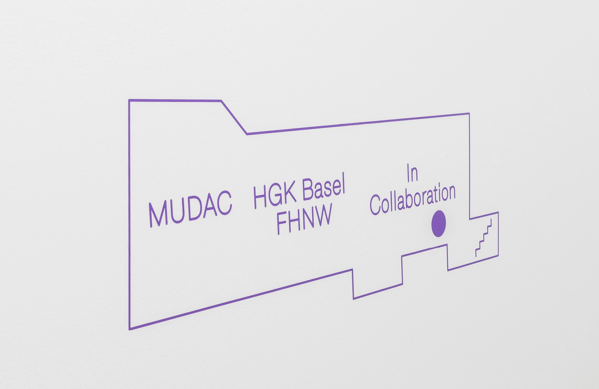
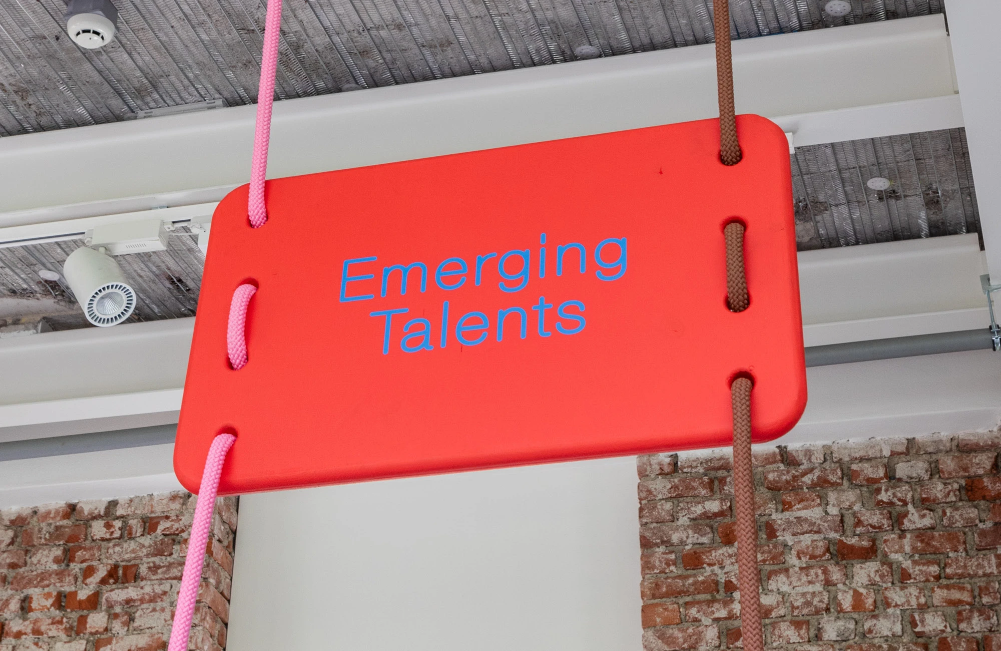
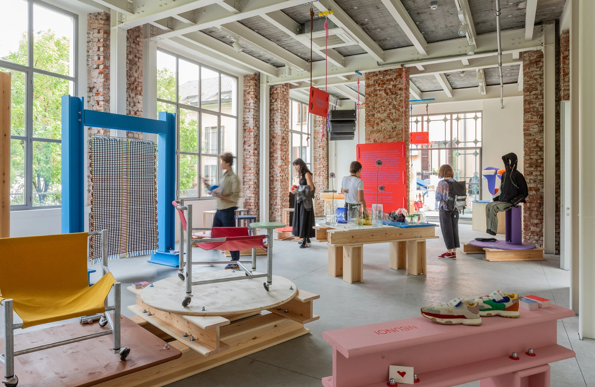
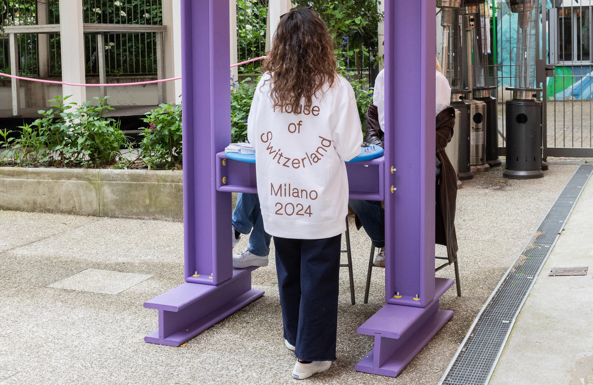
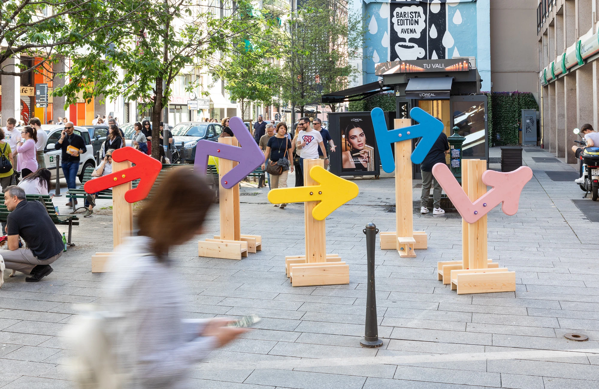
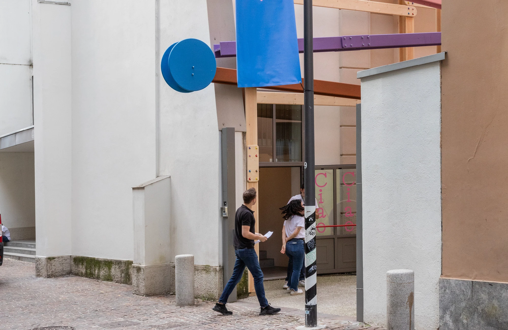
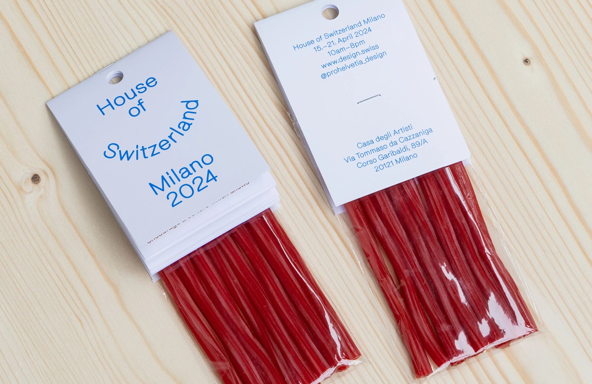
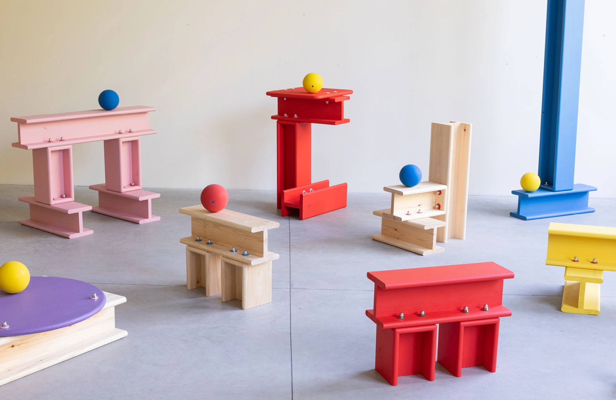
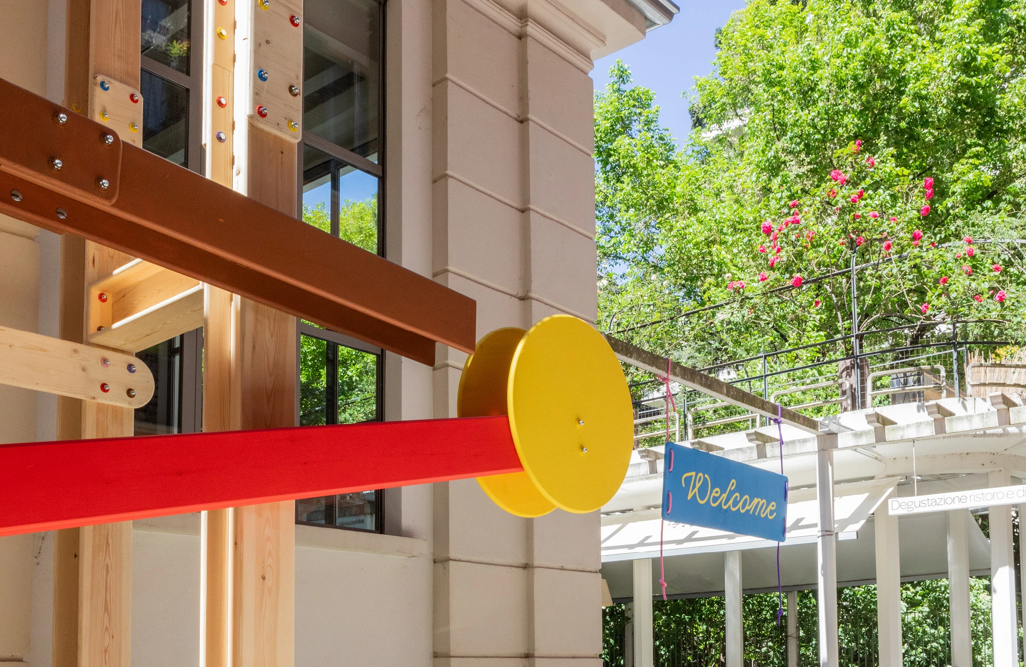
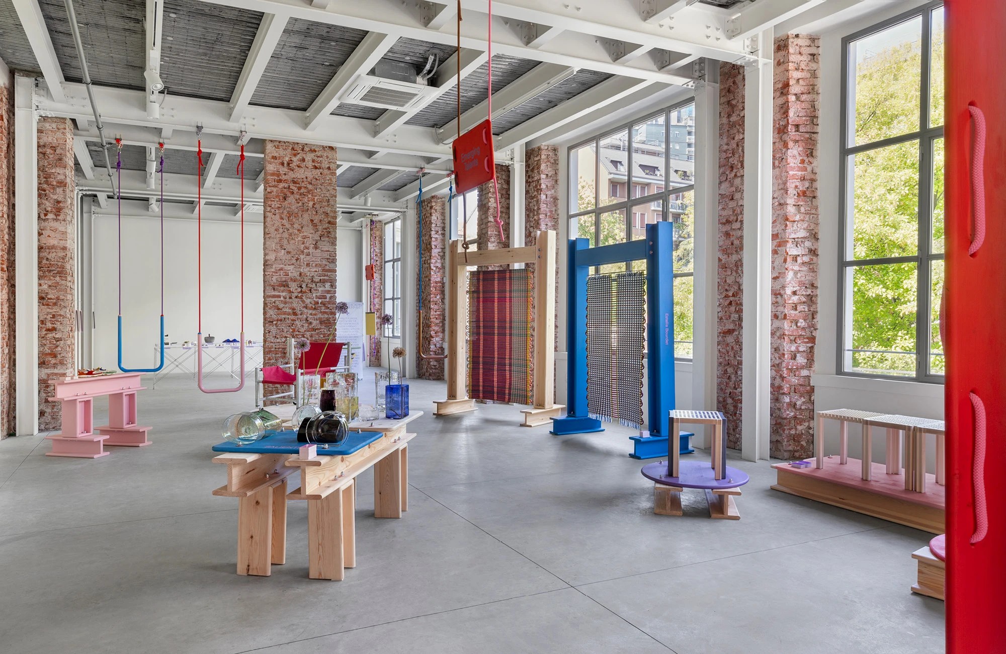
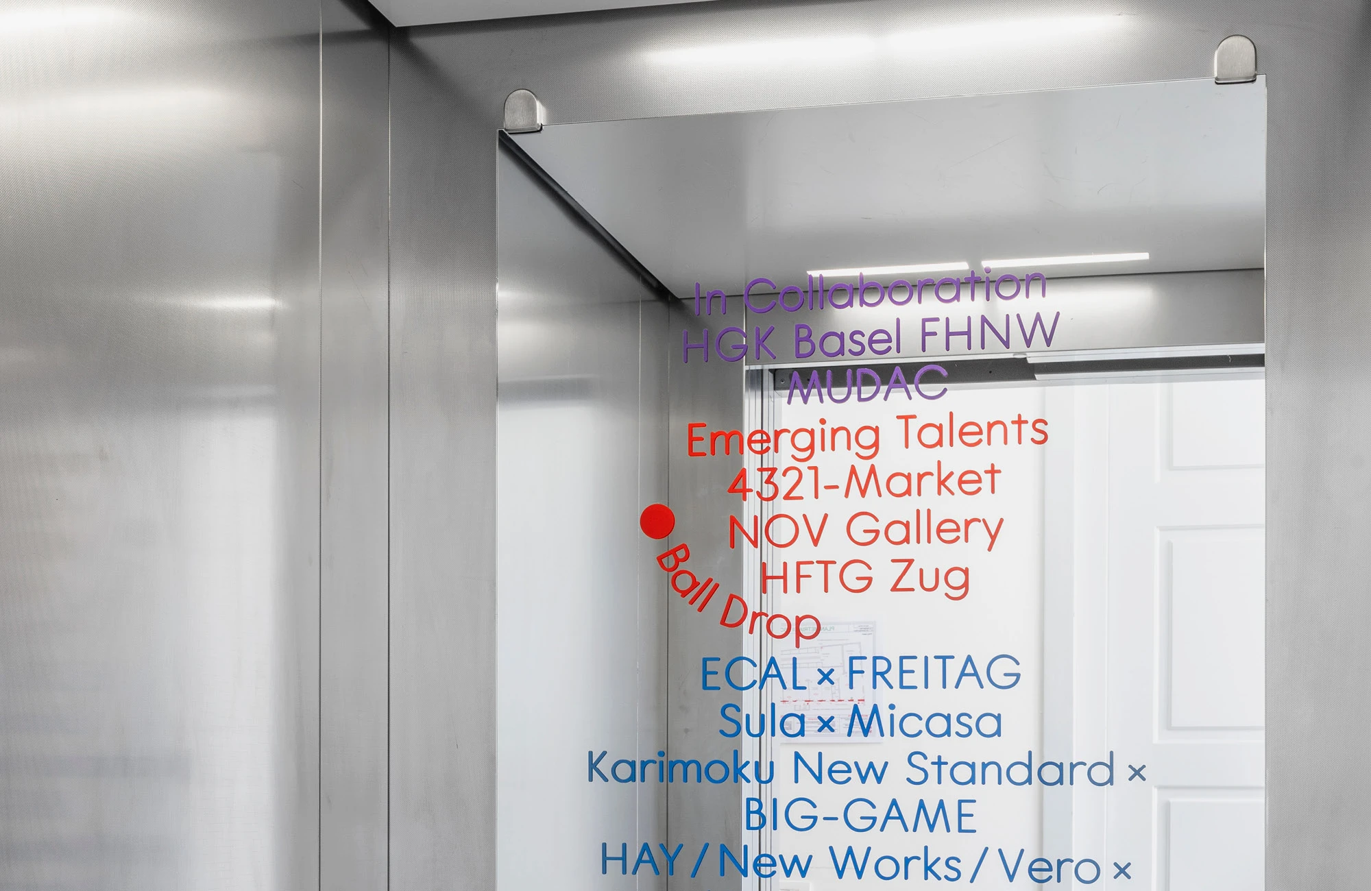
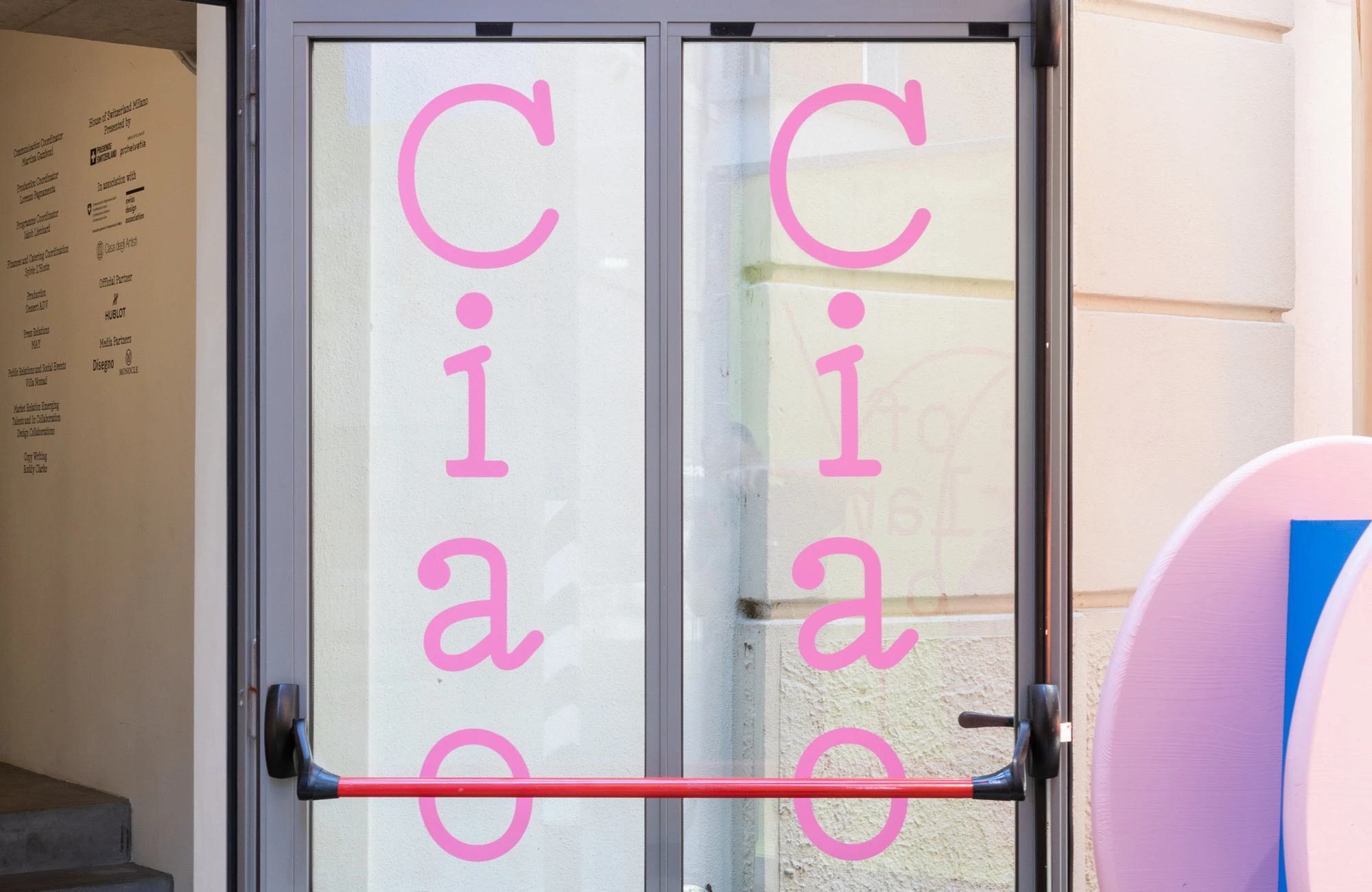
Presented by Pro Helvetia and Presence Switzerland, the House of Switzerland Milano hosts a collective exhibition showcasing Swiss design, during the Design Week in April. As the art direction team, in response to the theme of joy, we transformed the house into a playground. Using ropes as our primary material, we designed swings, lianas, and a comprehensive hanging signage system that integrated with the house’s architecture. The t-beams supporting the house and our playground elements inspired our display systems. We created various sculptural units by using one singular shape to showcase the works of all the designers. The ropes also inspired our typographical approach; we used a typeface whose letterforms are determined by the shape of a line. In our materials, digital and printed, typography was often on the move: jumping, swaying, sliding, and twirling. We welcomed everyone with a bigger-than-life marble track, a seesaw on the balcony, a bag of sweets along with the maps, and many more surprises throughout the house. In collaboration with Dorothee Dähler, Yeliz Secerli, Lukas Marstaller and Oliver Boualam.
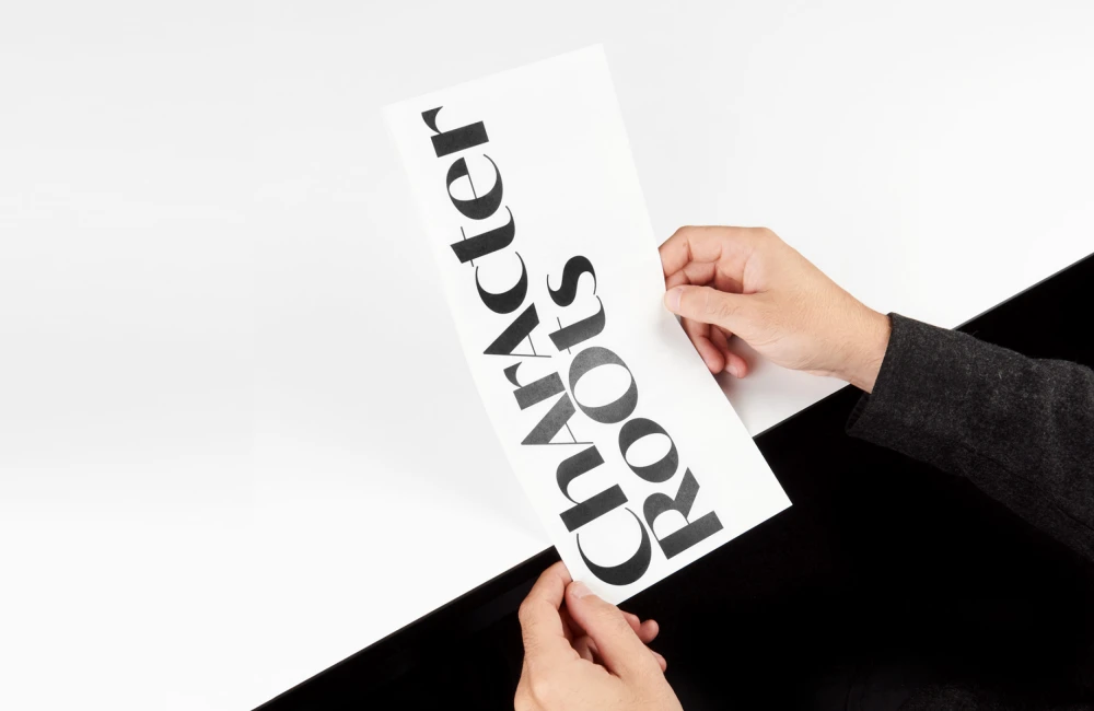
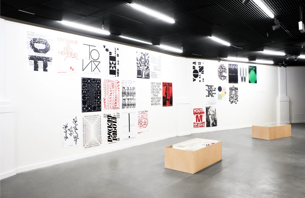
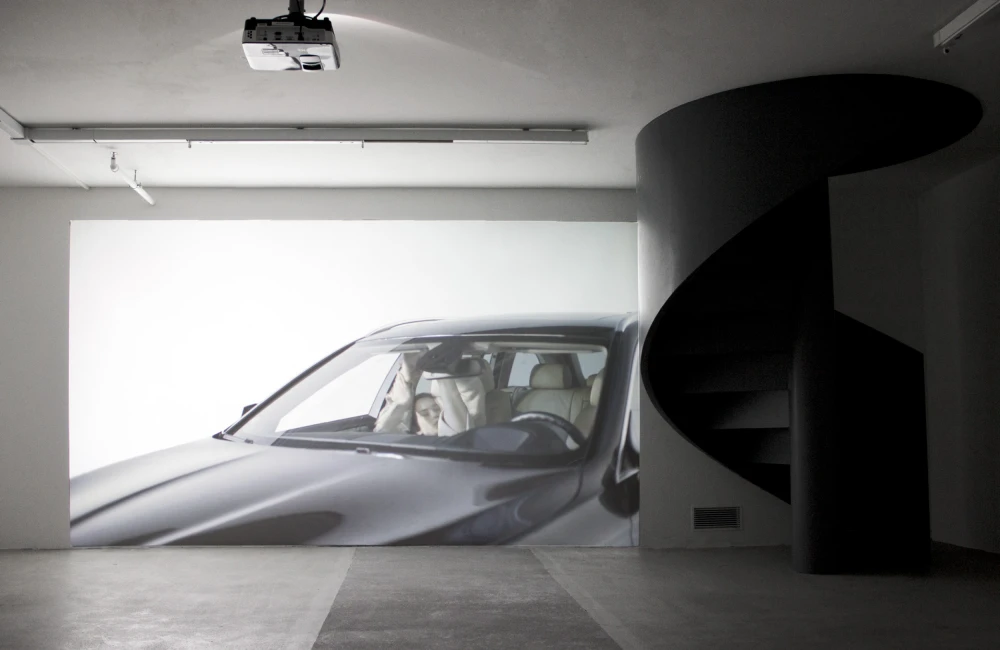
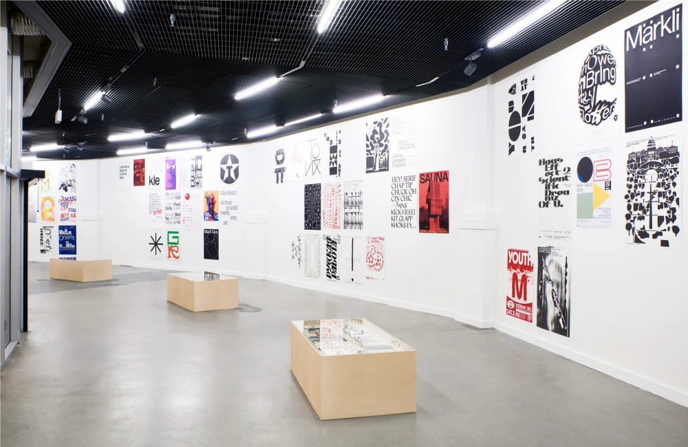
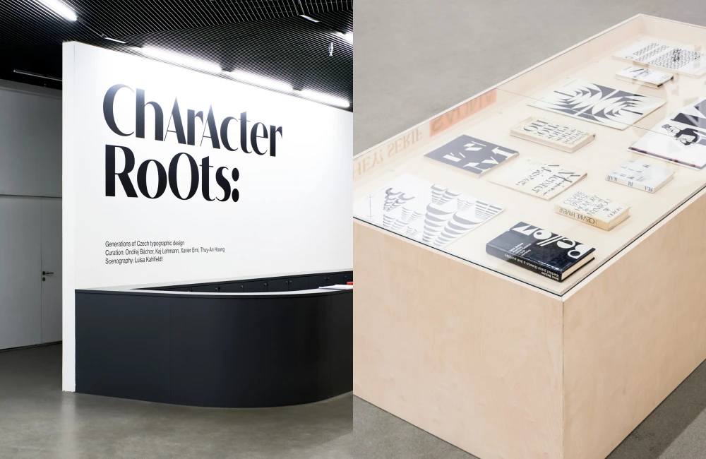
The exhibition Character Roots was part of the Weltformat Festival held in Lucerne in 2018. The festival featured current Czech designers and showcased a selection of typographic posters. By comparing contemporary posters with editorial designs from previous generations, the curators invited visitors to search for and find links between the past and the present. The exhibition was complemented by a video installation by Daniela and Linda Dostálková. The exhibition included works by 20yydesigners, adela&pauline, Ondřej Báchor, Zuzana Burgrová, Tomáš Celizna, Martin Groch, Heavyweight, Jan Horčík, Cindy Kutíková, Laborator, Adam Macháček, Štěpán Marko, Jiří Mocek, Marek Nedelka, Jan Novák, Parallel Practice, Radim Peško, Martin Vácha, Daniel Vojtíšek and Nikola Wilde.
Character Roots:
Generations of Czech typographic Design
Weltformat Festival, 29.9. – 7.10. 2018
Curation: Ondřej Báchor, Kaj Lehmann, Xavier Erni, Thuy-An Hoang
Scenography: Luisa Kahlfeldt
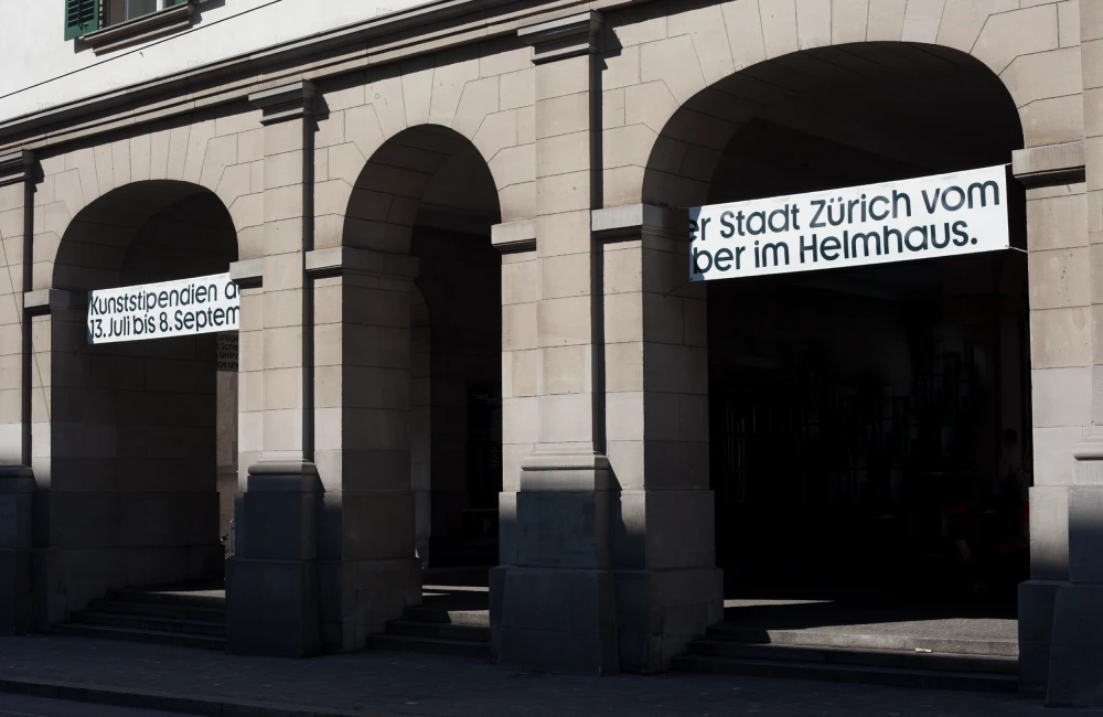
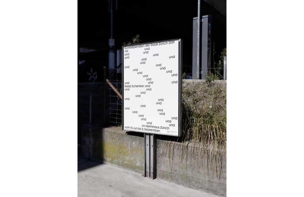
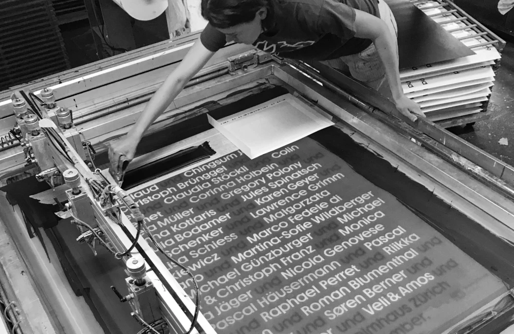
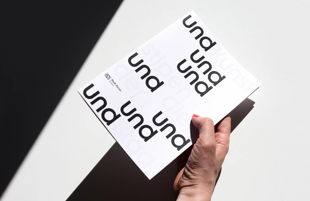
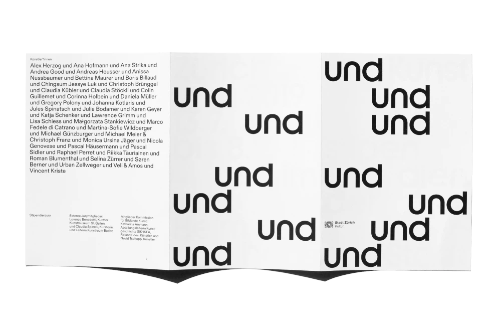
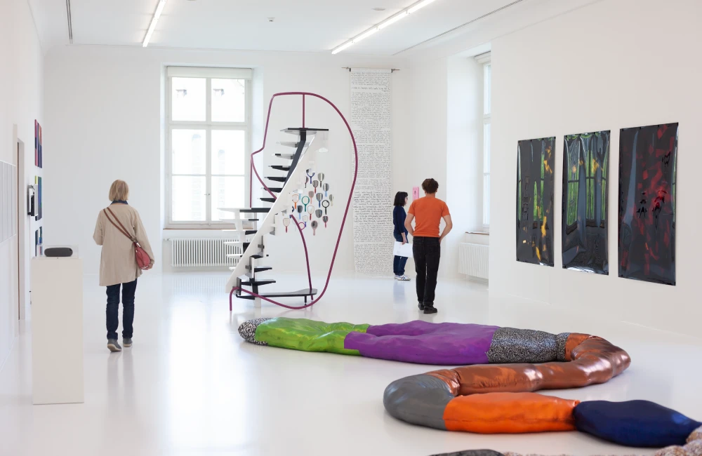
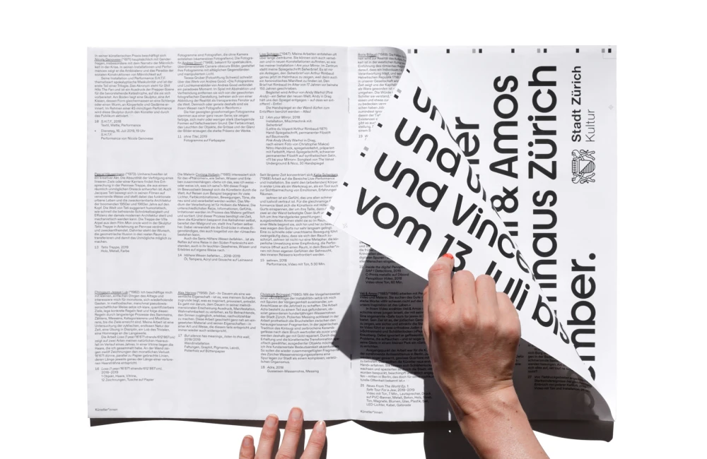
The City of Zurich Art Grants Exhibition is a group exhibition of 40 positions with one common denominator: its artists living in Zurich. Part of the briefing was to work with the names of the artists. The design-process was mainly experiments on how to structure lists of names, resulting in the decision to work with the word «und» (and) to separate, yet bring together each name in ultimately one single sentence. By silkscreen-printing one name on each poster, the list of names was then spread geographically and randomly throughout the city.

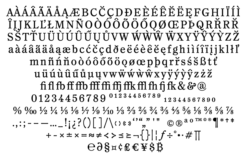
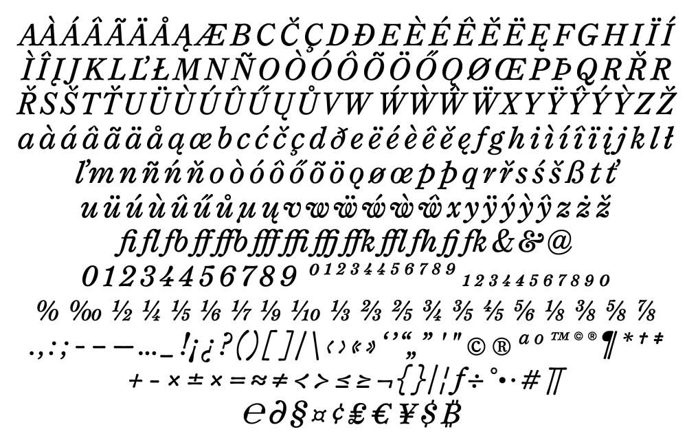
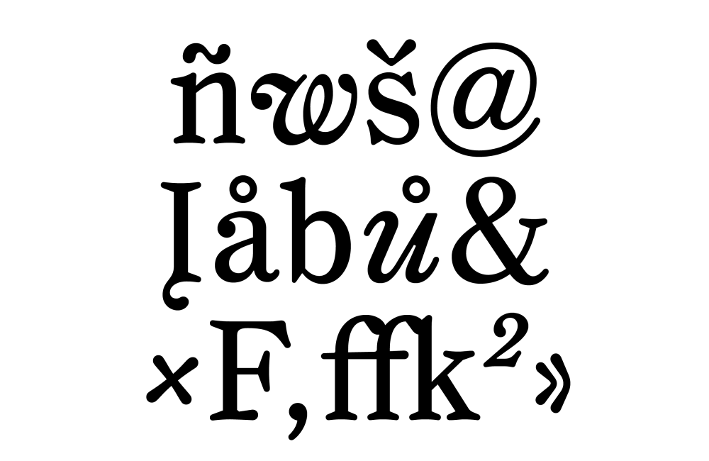
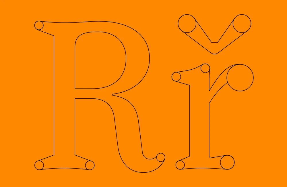
Rungli is a serif typeface with circular and strangely expanding letter-shapes. It provides a smooth reading experience in small text-sizes, while at big sizes its quirky features become apparent. In terms of taxonomy it is rooted in the Century Oldstyle family. Head over to the Rungli micropage for more information, testing and – if interested – requesting a license.
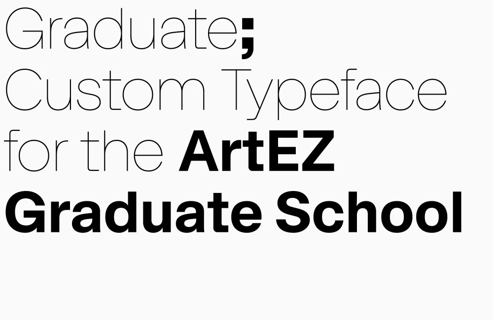
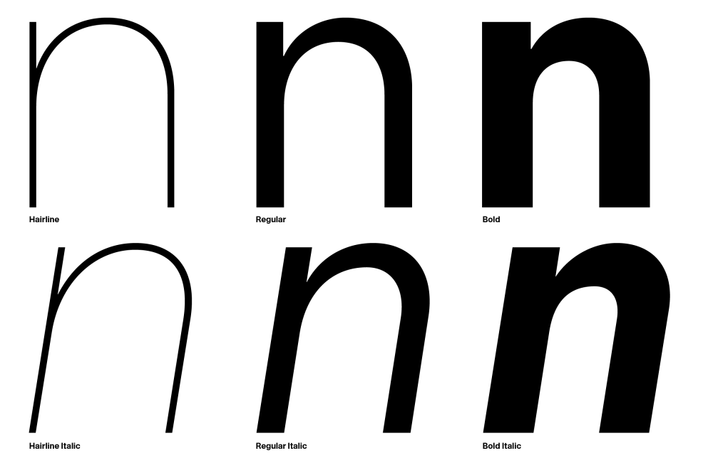
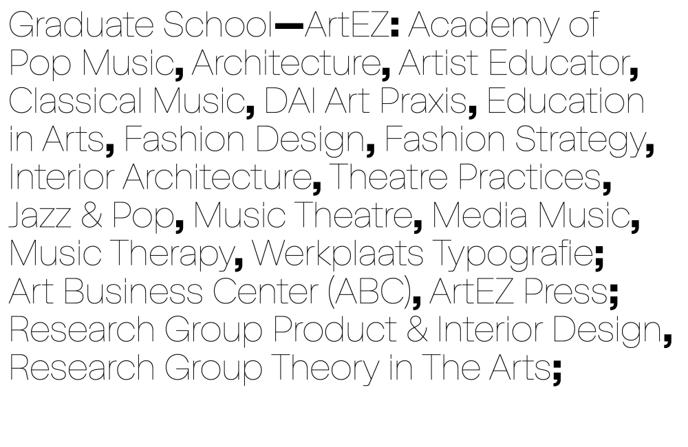
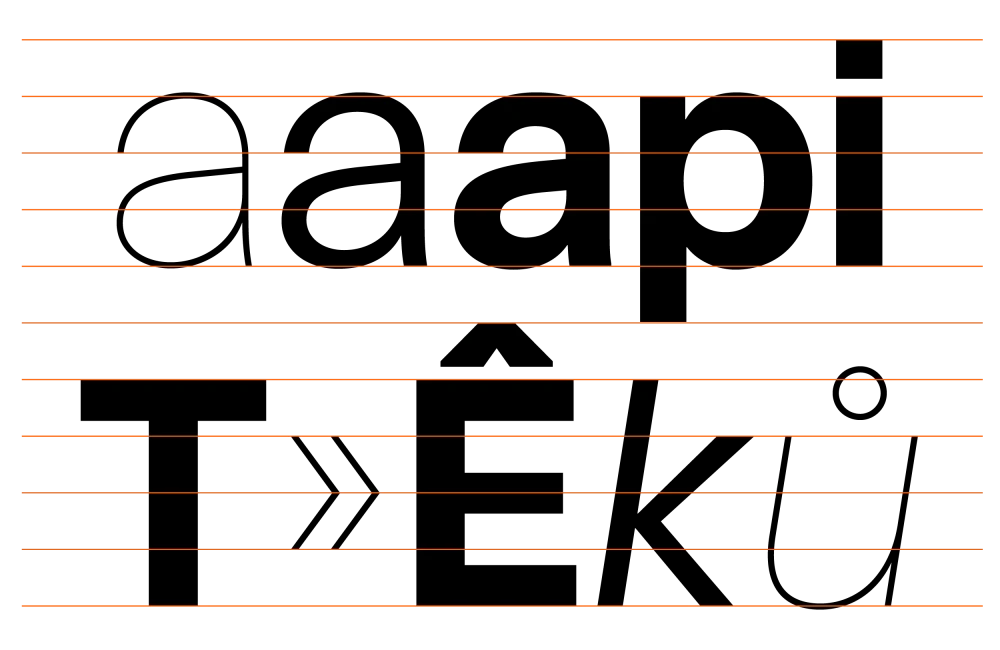
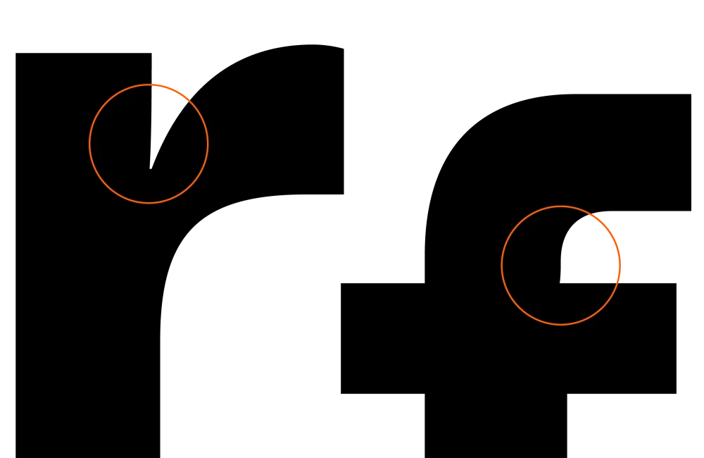
The Graduate School of the ArtEZ (Arnhem, NL) is currently redefining its identity. Dorothee Dähler and Yeliz Secerly, both graduates of the Werkplaats Typografie in Arnhem, are working on this assignment and asked me to develop a typeface that suits their concept and is easily applicable. By including systematic vertical Metrics, the font should be always used with the same value in leading and font-size (20pt/20pt, for ex.). Kerning: Igino Marini, Proofing: Davide Tomatis, Mastering: Benedikt Bramböck (via Alphabet).
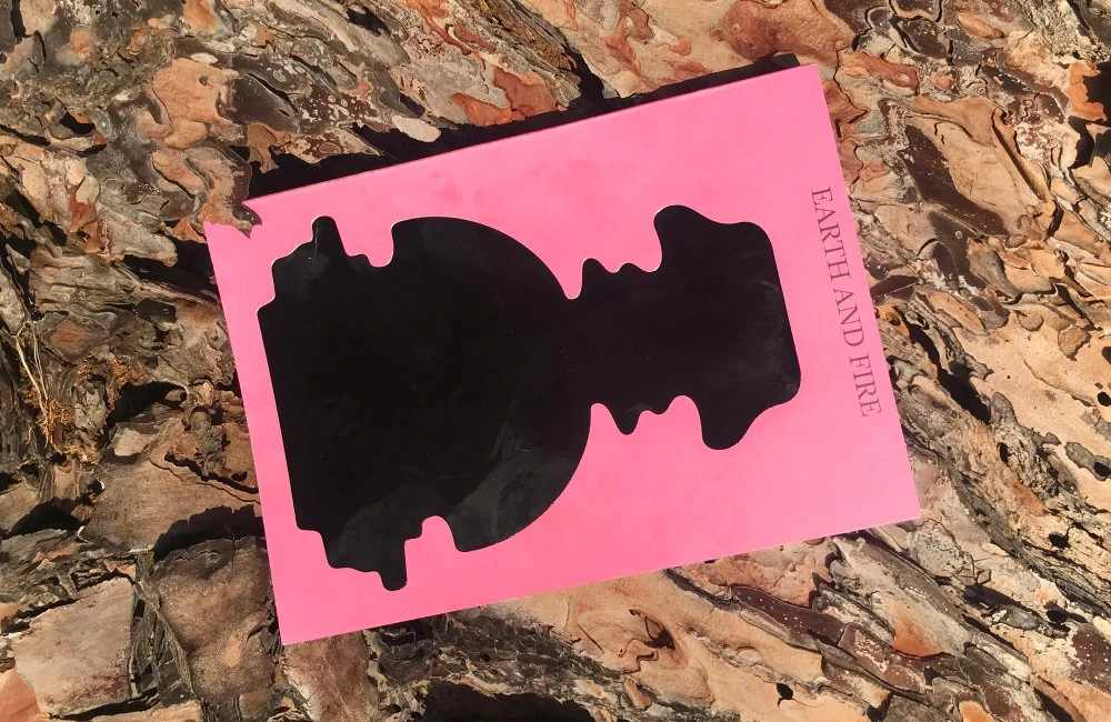
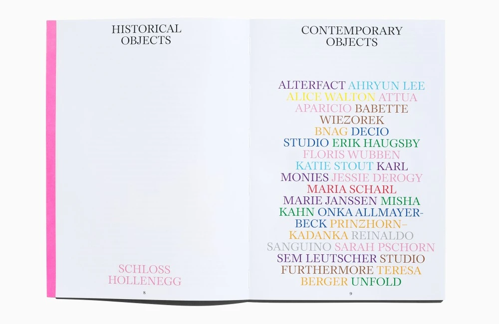
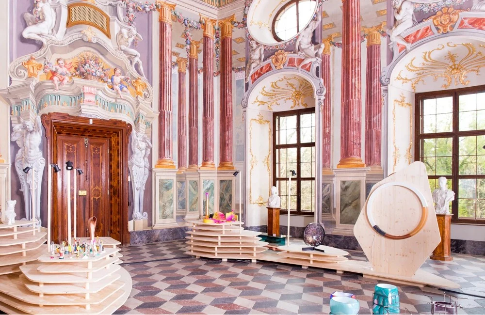
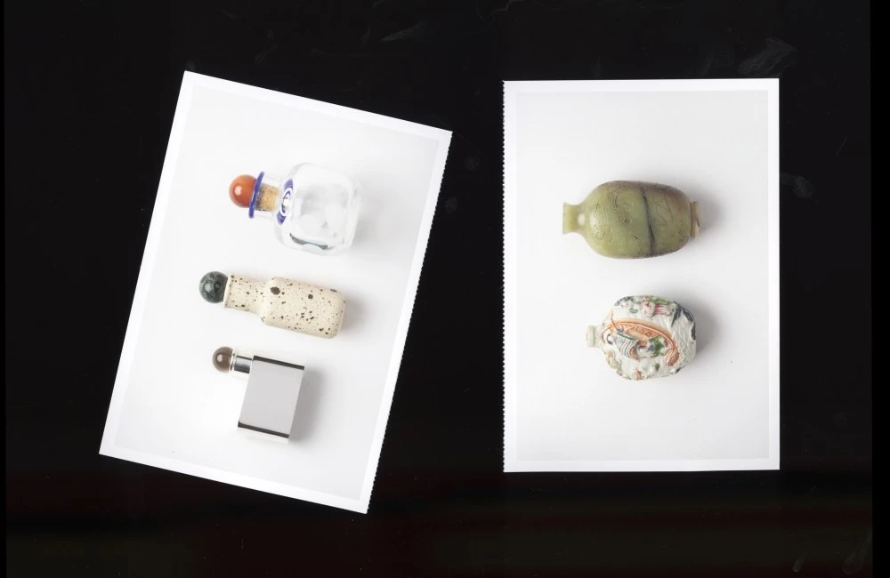
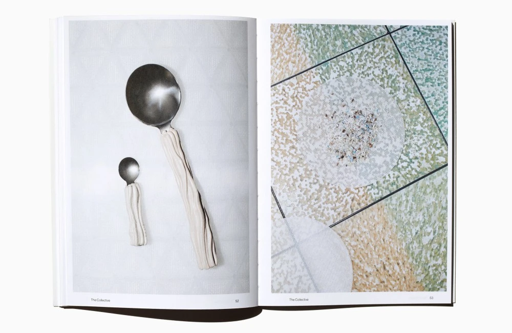
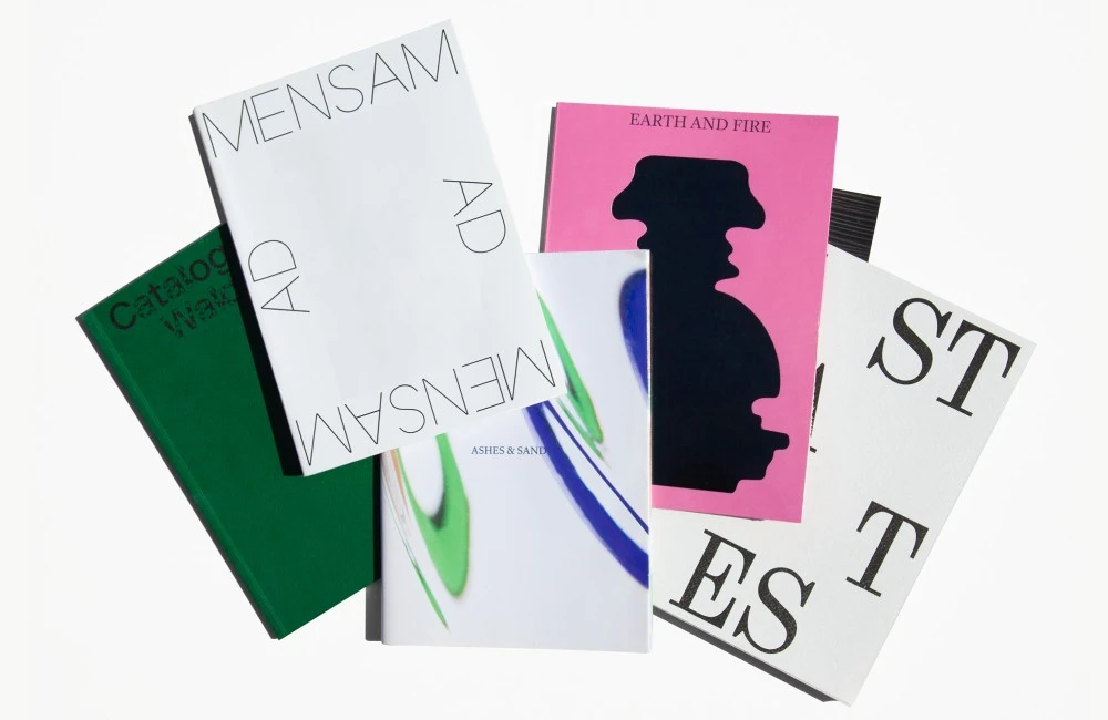
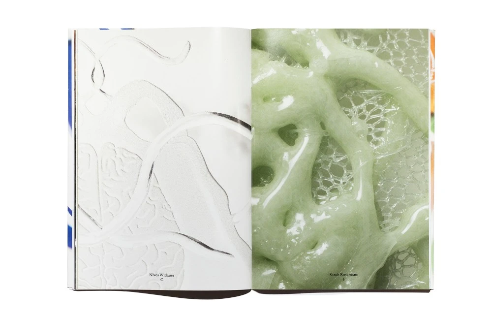
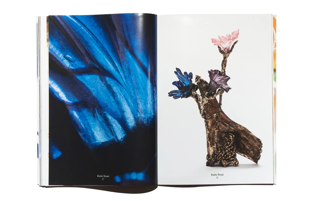
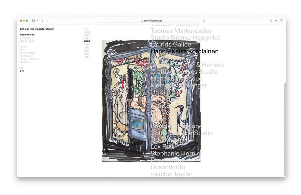
Schloss Hollenegg for Design is a project led by curator Alice Stori Liechtenstein. Every year, she welcomes up-and-coming industrial designers to stay at the castle in Hollenegg, Austria, and showcases their creations. Between 2018 and 2024, together with Dorothee Dähler, we've been in close contact with Alice for every exhibition to create the Exhibition Graphics, the Catalogue and the Website. Many times we have been generously invited to work, discuss and celebrate design in the castle near Graz, which has been the most wonderful experience.
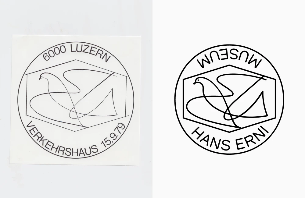
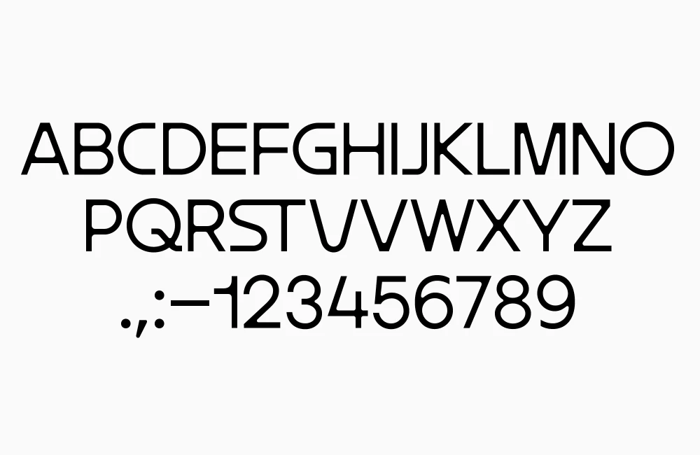
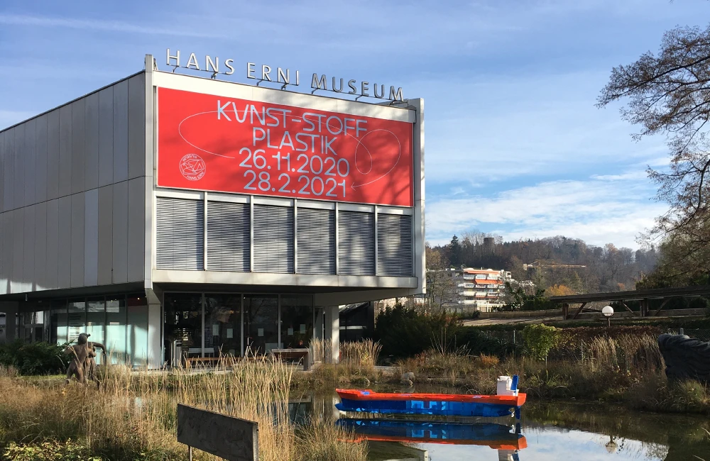
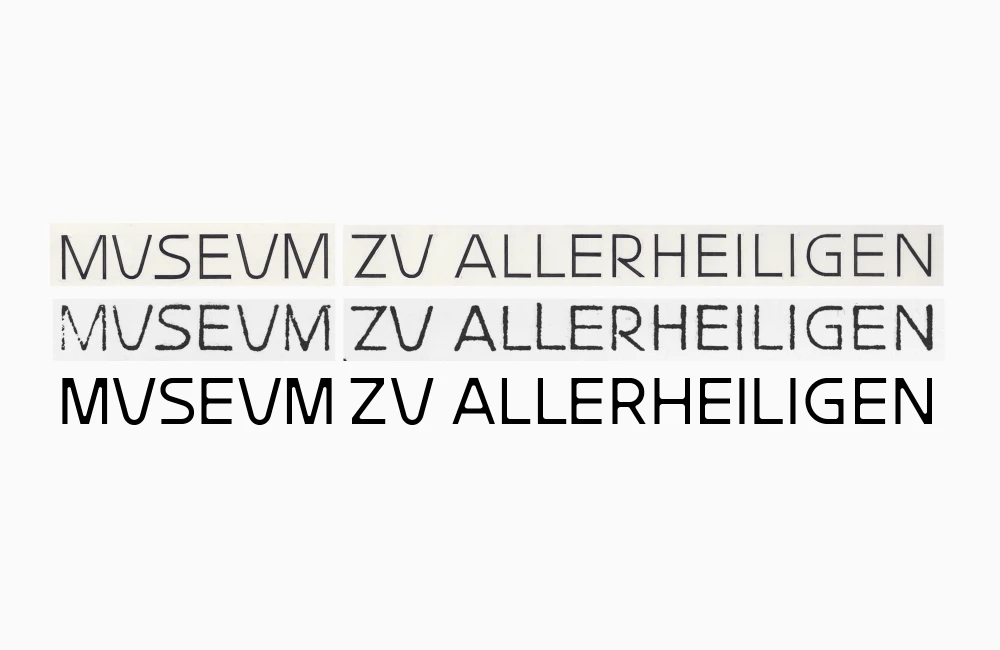
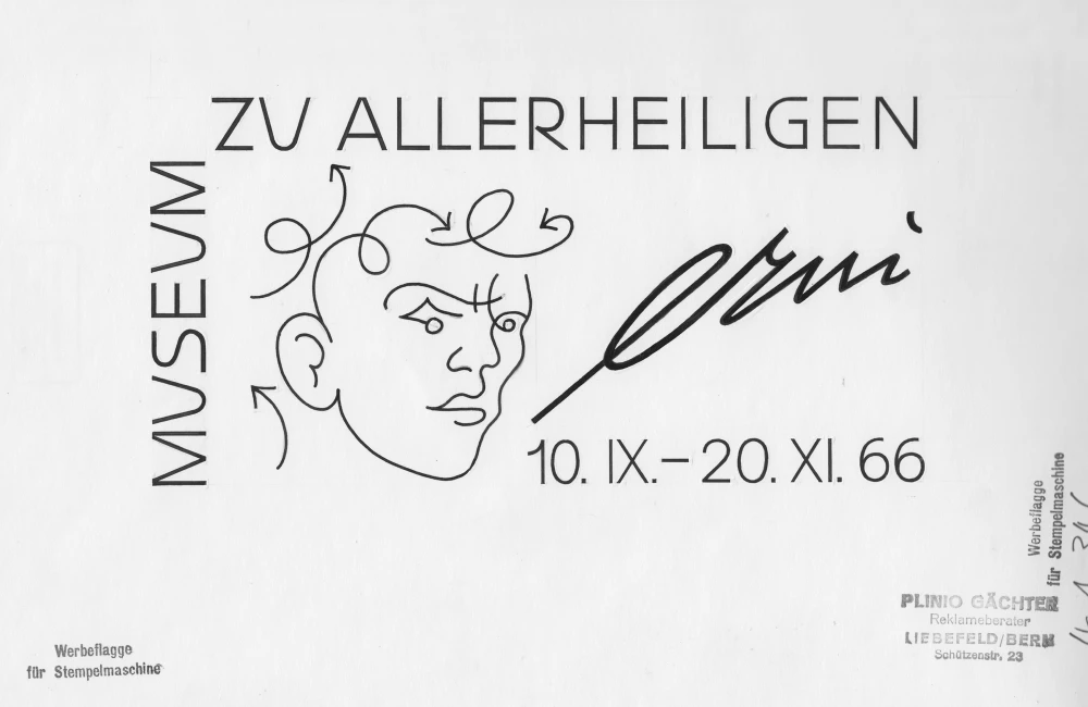
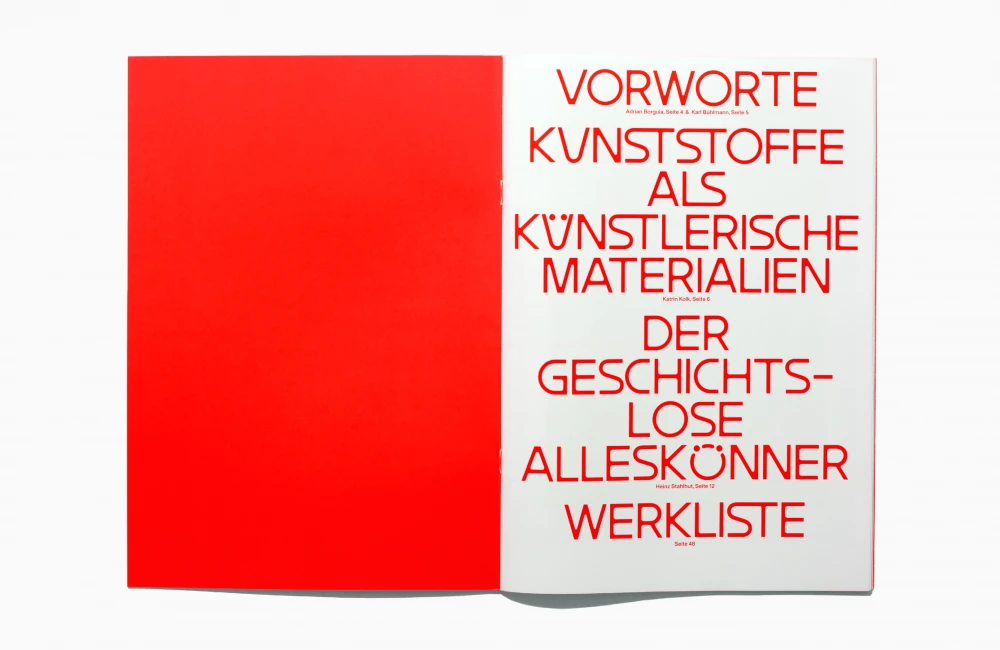
Together with Dorothee Dähler, we developed a new Identity for the Hans Erni Museum. While studying his work, we came across his philateslistic works stored in the PTT archives in Bern. What was exciting about these works was that Erni worked with simple, reduced forms. For example, the stamp with the dove of peace for the opening of the museum, we found very beautiful. We used this as a template for a new stamp and typeface, which we can now freely use in the CI. You can find more information about the project on our joint website daehlerlehmann.works.